
FatigueM8 Friday’s (post 2).
We’ll kick off with the photo of the week (as judged by me!). The front facing camera has captured some stunning sunrise photos, enhanced somewhat by the lack of an Infrared filter #nofilter literally! This one was from Friday morning just before 5:55am.

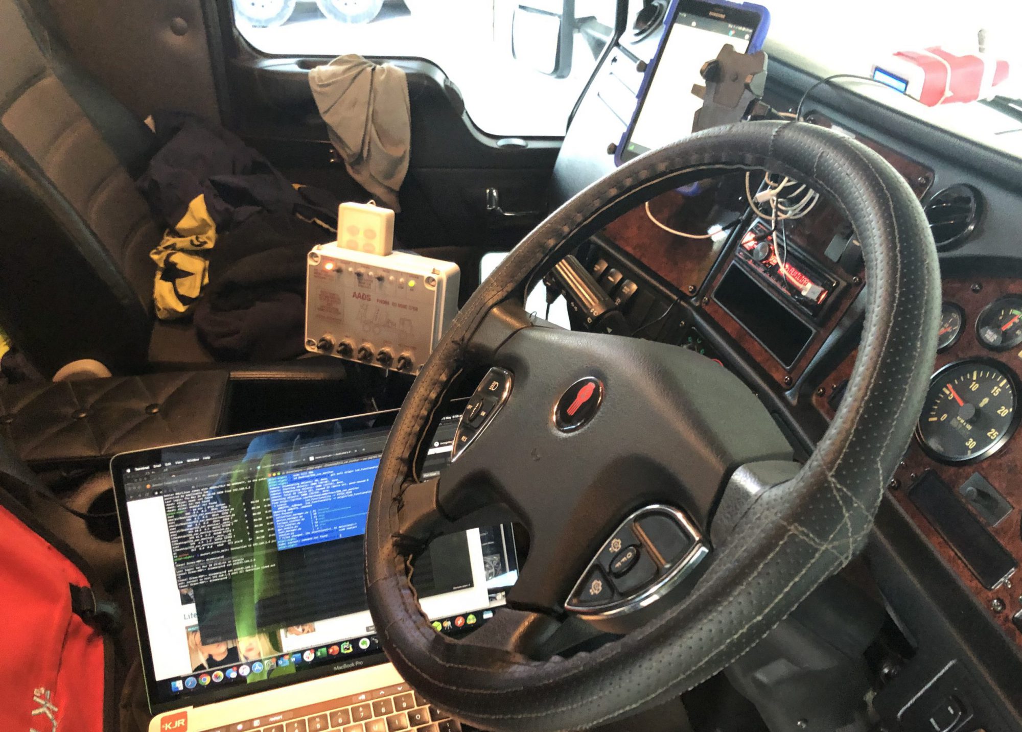
This week saw the FatigueM8 journey take another leap forward with the deployment of a site-collection point (wifi + 4G). Also known as the FatigueM8 comm’s box.

The Comm’s box implementation is simple, but effective, and allows for all the FatigueM8 units to transmit data whenever they’re in the yard. The work patterns of the cement trucks aka as “Agi’s” pronounced “ad-geez”, is they get filled with concrete/cement in the yard, then deliver the load to site, before returning to the yard. The timing of the trips is anywhere from 30 mins to several hours and this lends itself well to periodic upload and analysis by FatigueM8.
The Comm’s box, when combined with the persistently installed FatigueM8 unit allows for constant collection and analysis of the drivers ECG activity during the day.

Now with the data following in from our drivers, we’ve created a simple dashboard using AWS Quicksight, drawing data from S3 via Athena. Currently the dashboard compares the statistic’s of two (2) of our drivers. We compare the number of valid ECG readings, average heart rate by hour of the day, Root Mean Square of Successive Differences (RMSSD) and a plot of the journeys the drivers have taken via GPS recordings. The RMSSD is one of the time domain measurements that can be used to Heart Rate Variance (HRV). These graphs have a weeks worth of aggregated for display.

This week, one of the GPS’s had an issue and hence the reason there is only one colour (blue) on the map plot.
An interesting point to note about driver 2019-0001, who’s data is represented in blue across all of the graphs, is the gap from in the data consistently between 9am and 10am. This gap corresponds to their attendance in the office for a daily COVID-19 meetings.
Until next week, stay safe, socially distanced but not isolated #stayconnected.